Stop the Press Redesigns Faction Icons
Developer seeks feedback on redesigned faction icons for clarity and readability
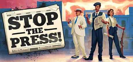
A developer has taken to Reddit to gather feedback on the redesigned faction icons for their game, Stop the Press. The goal is to create icons that are clear and readable, even on a small pixel grid, and convey the political stance of each of the four main factions.
The developer has received feedback that previous icons were unclear and is now seeking input from the community to ensure the new designs are effective. The icons are a crucial part of the game, and the developer wants to ensure they accurately represent the different factions.
The game, Stop the Press, is available on Steam, but the developer has chosen not to reveal too much about the factions on the store page, instead opting to engage with the community directly. With 164 upvotes and 223 comments, the post has generated significant interest and discussion.
The redesign process is an important step in the game's development, and the developer's willingness to listen to feedback and make changes demonstrates a commitment to creating a high-quality gaming experience. As the game continues to evolve, it will be interesting to see how the final icon designs are received by players.